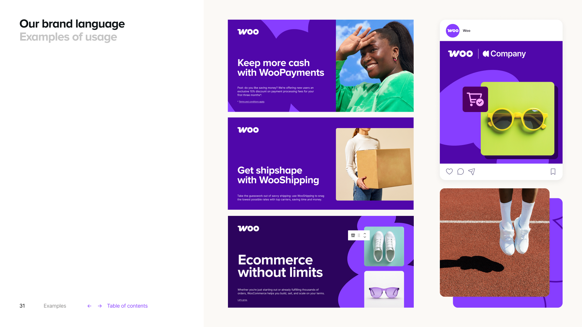
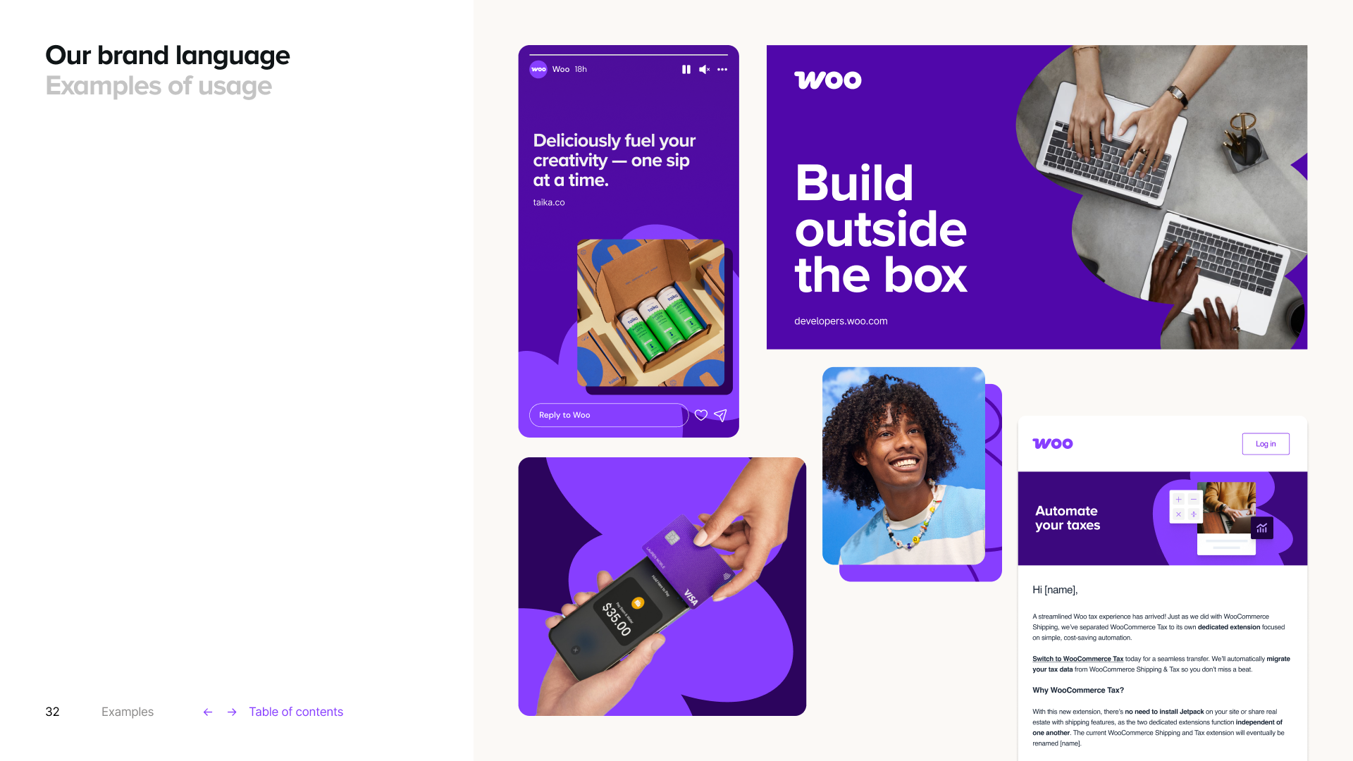
Woocommerce rebrand
In this much-needed brand evolution, we elevated everything from our logo to our color palette to our voice and tone in a way that’s uniquely and utterly Woo. It set the tone for a new era for WooCommerce, signaling our maturation as a brand, and that we — along with our 4M+ merchants, thousands of developers, and partners — believe in our future as the platform of choice for merchants who truly want to own their stores. It was done entirely in house.
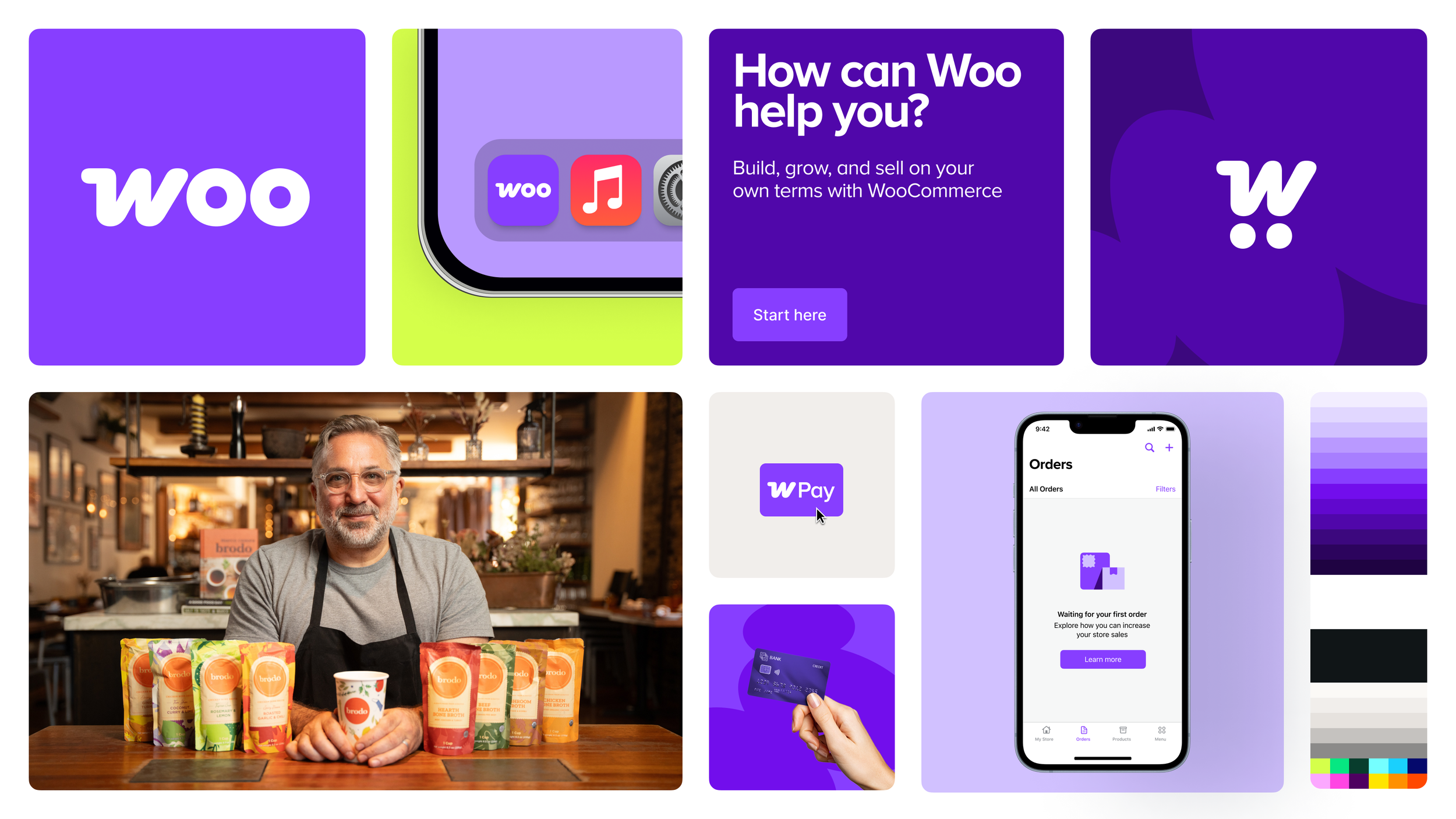
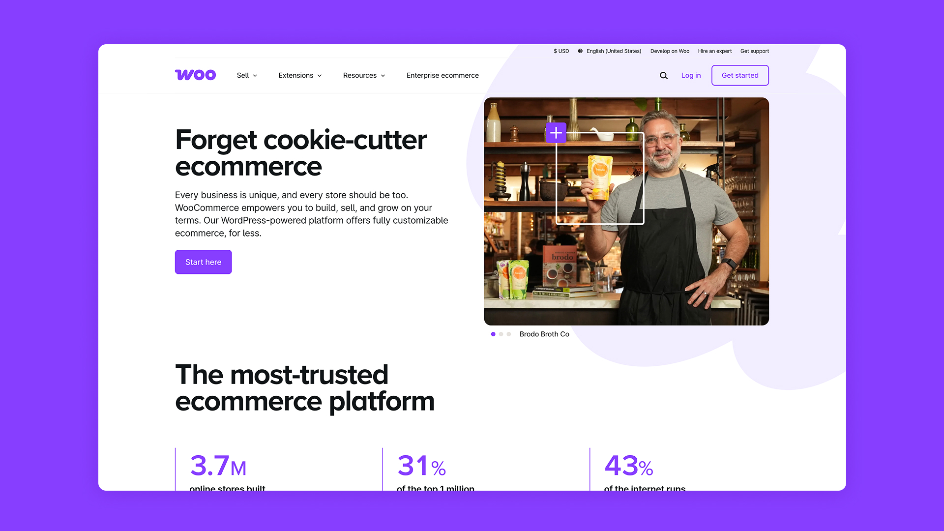

Logo
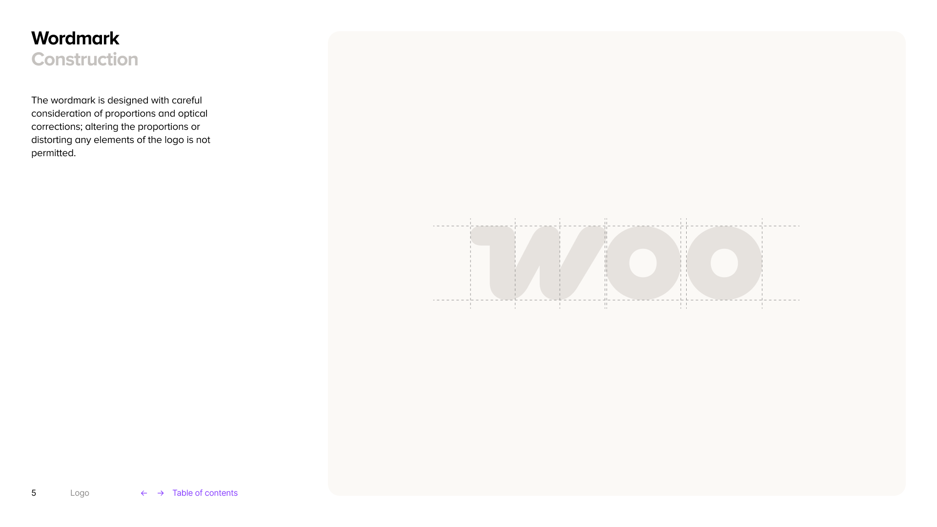
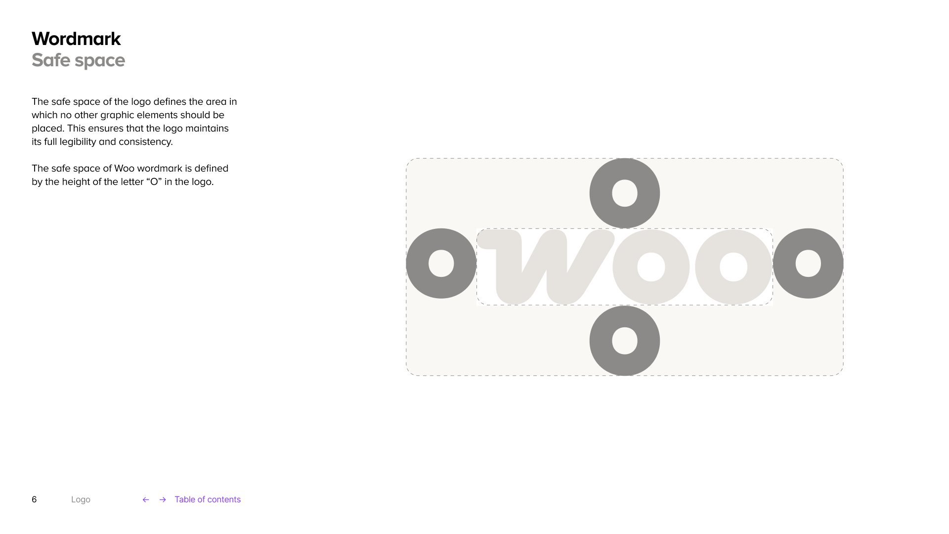
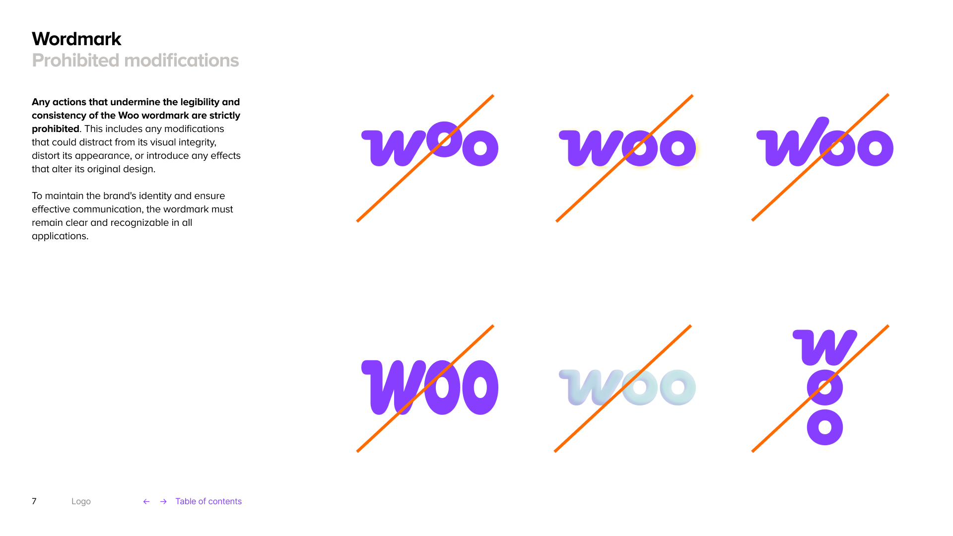
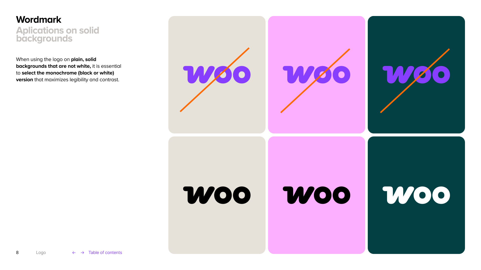
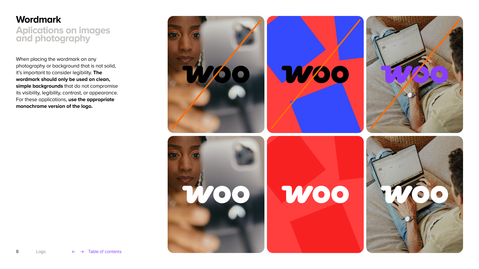
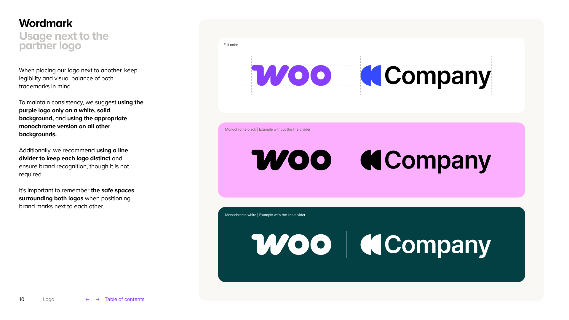
First things first: our logo was in dire need of a refresh. We explored reworking the old logo’s speech bubble, experimenting with commerce ephemera (think labels, stickers), and eventually, landed on a more literal representation: a shopping cart, hidden in the lines of our name. It’s whimsical yet simple and elegant, scalable across different applications, and set the tone for the rest of the rebrand.
Voice and tone
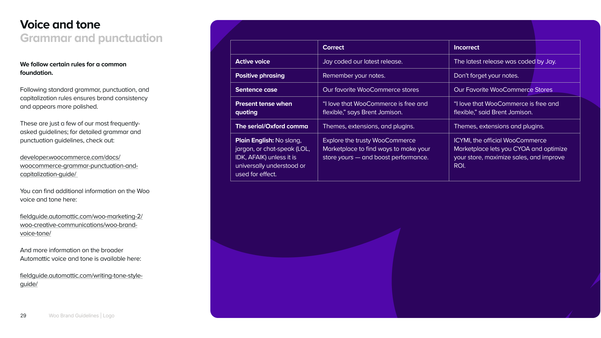
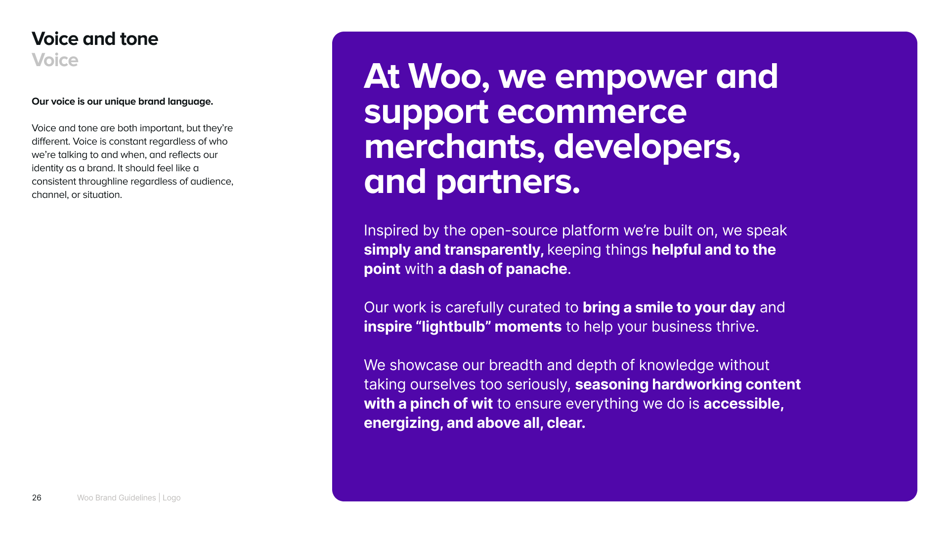
Speaking of tone… Since voice and tone is kind of my thing, let’s zoom in on that. This was one of my favorite projects at Woo (I’ve got a soft spot for rebrands from my agency days). There are endless ways to outline voice and tone guidelines, but I kept it fairly straightforward with 3 major elements:
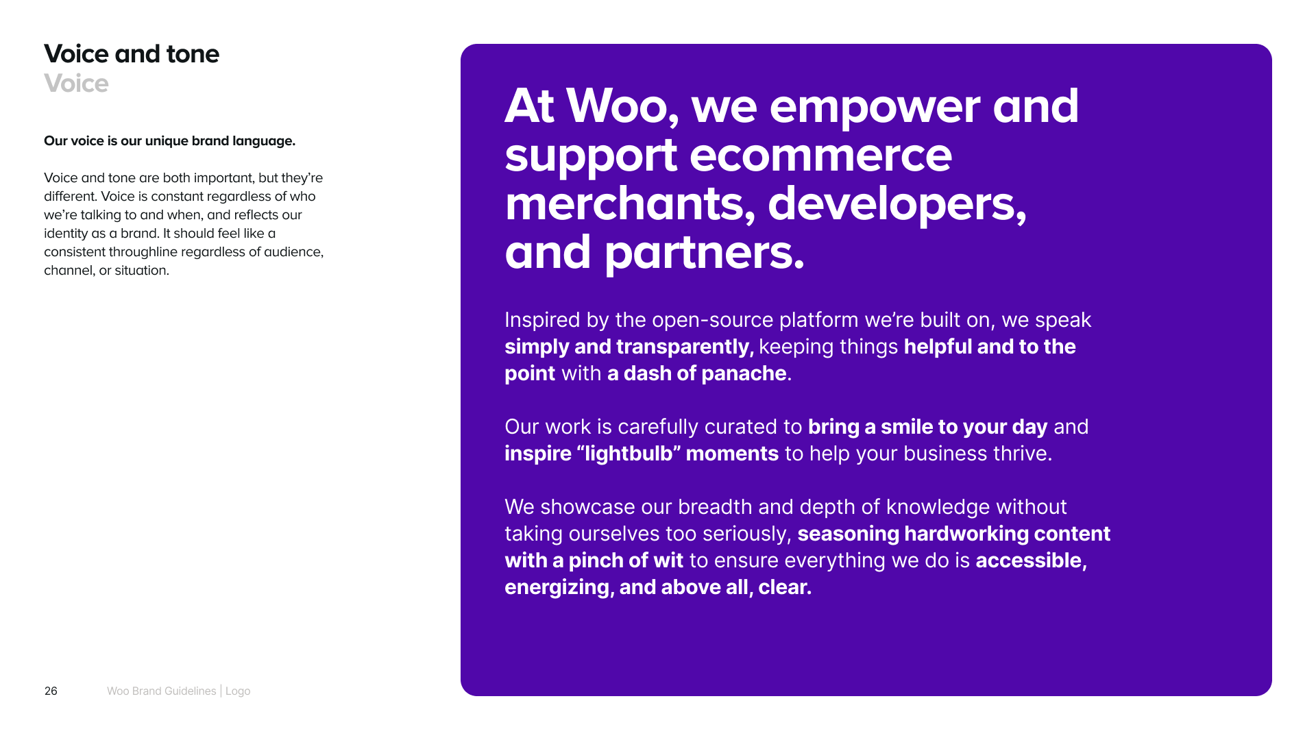
Our brand voice: This explains our overall approach to language. The Woo voice is grounded in simplicity, honesty, and wit. We don’t take ourselves too seriously, but we take your business very seriously — and that shows in everything we do.
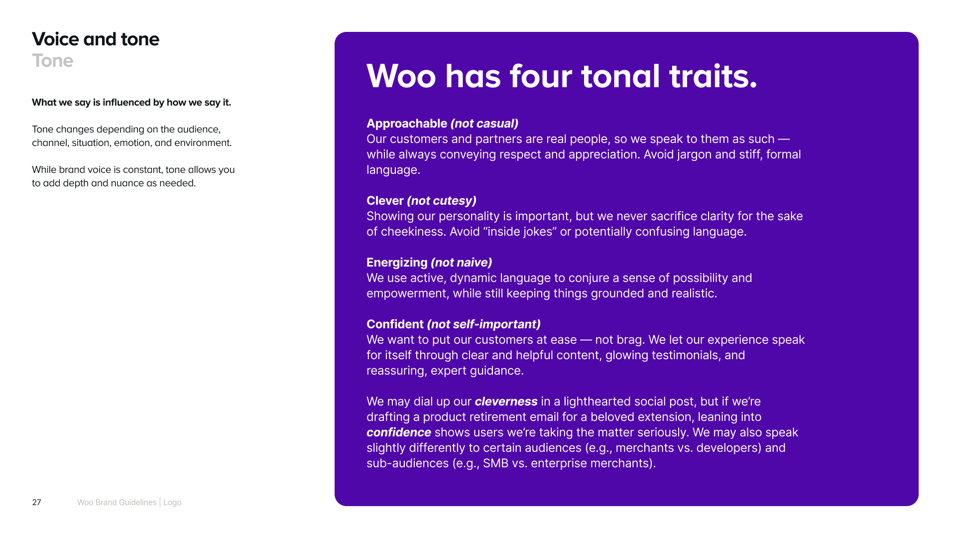
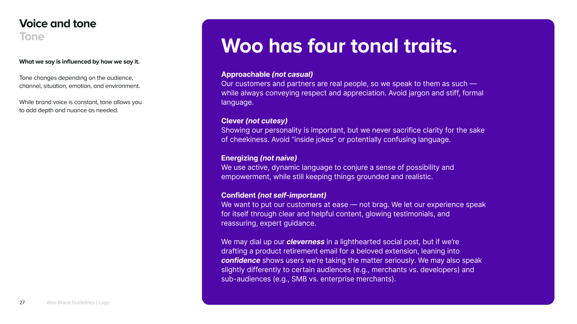
Our four tonal traits: These dive into how we say what we say. I like to use a clear “this, not that” strategy when identifying tonal traits to define nuance. Depending on which audience, channel, and situation we’re writing for, we lean into being approachable, clever, energizing, and confident.
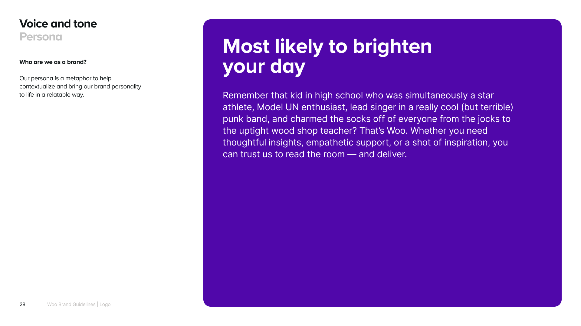
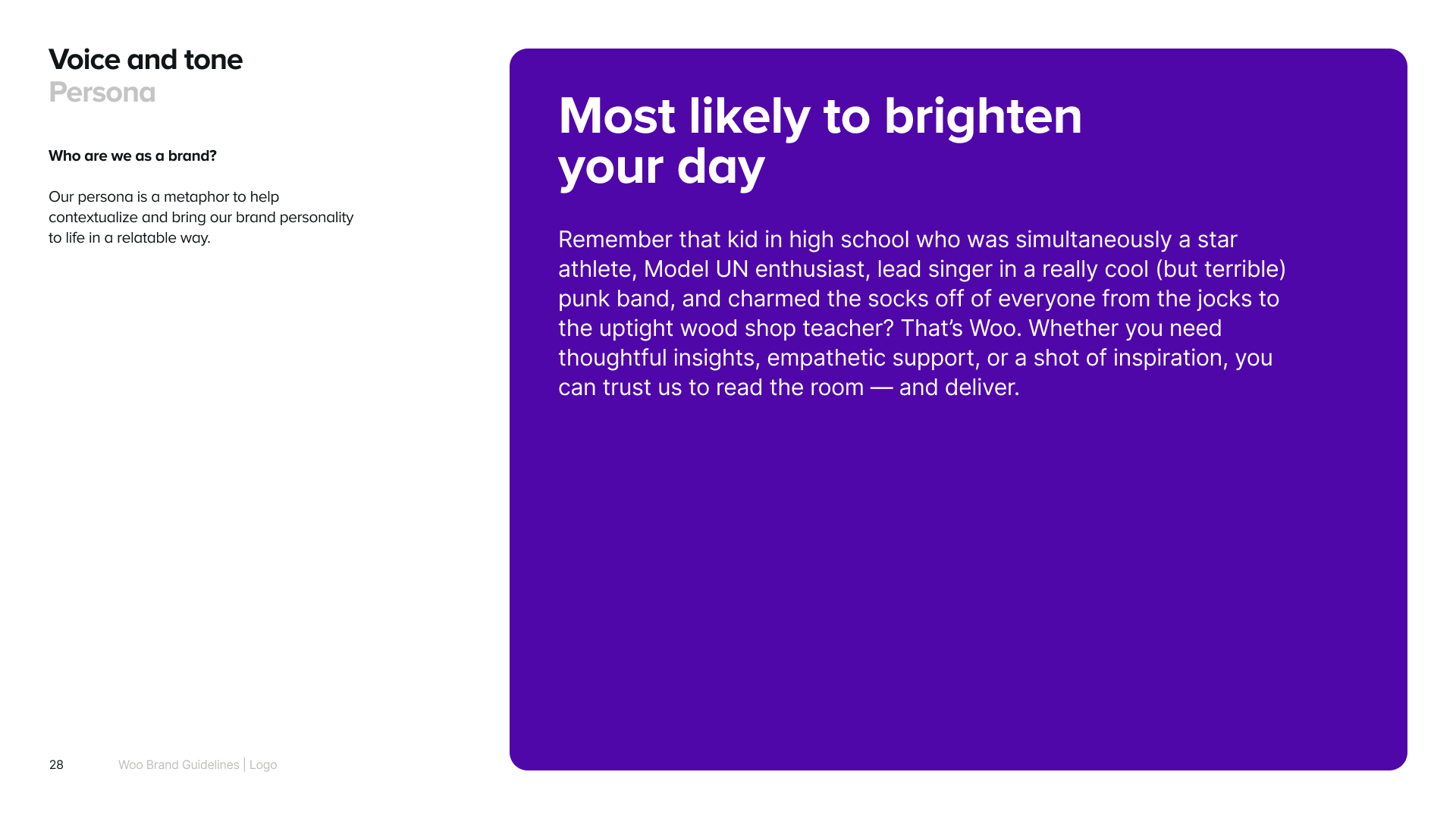
Our brand persona: In my opinion, this is the fastest way to learn a new brand you’re writing for: ask your team to define your brand as a person. You know, “the cool uncle that knows way too much about gardening, and who’s super jazzed to lend you his artisanal trowel”. Our persona pays homage to WooCommerce’s signature flexibility: we’re an ecommerce chameleon, and dangit, we’re likable!


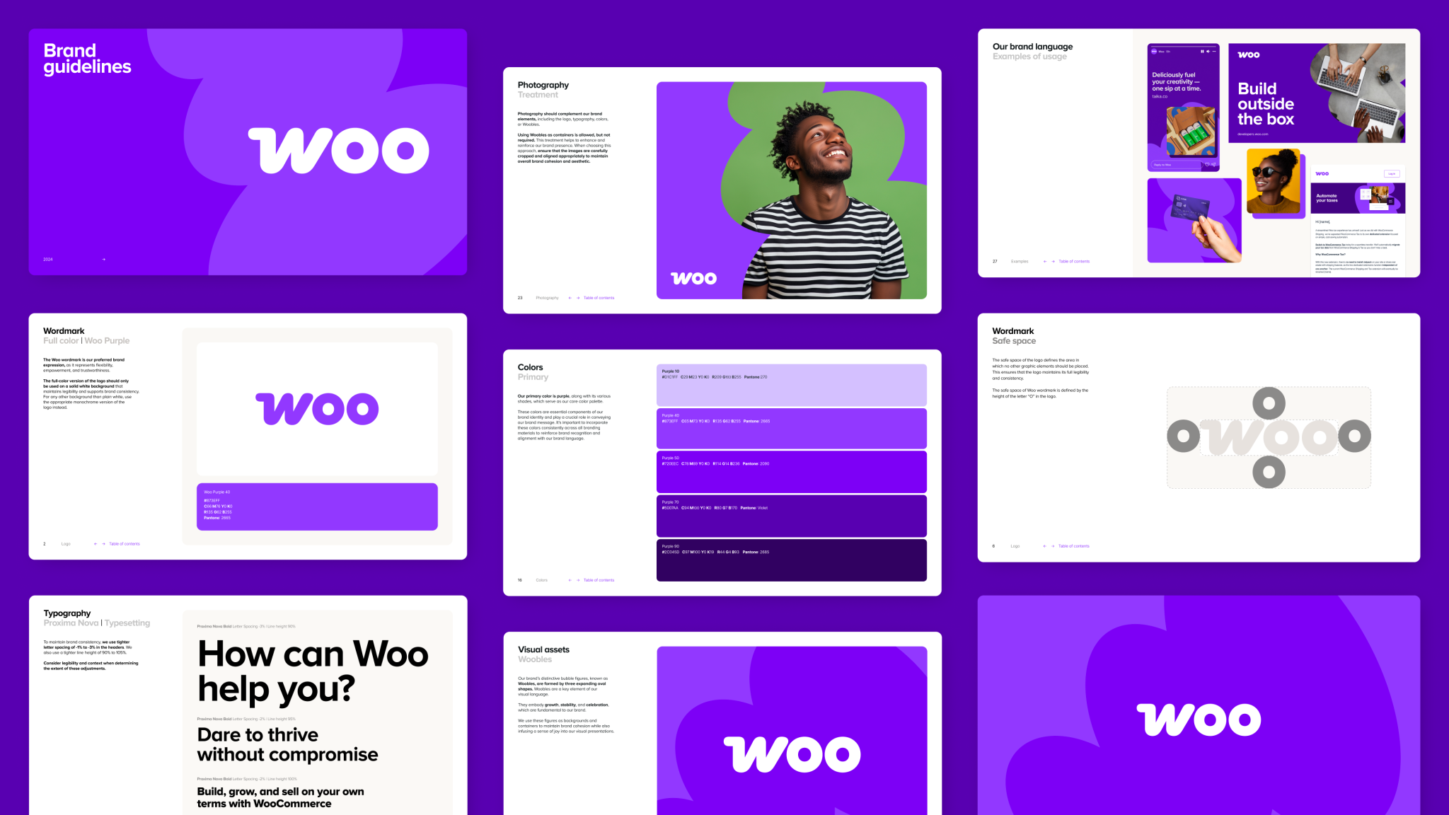
Brand guidelines
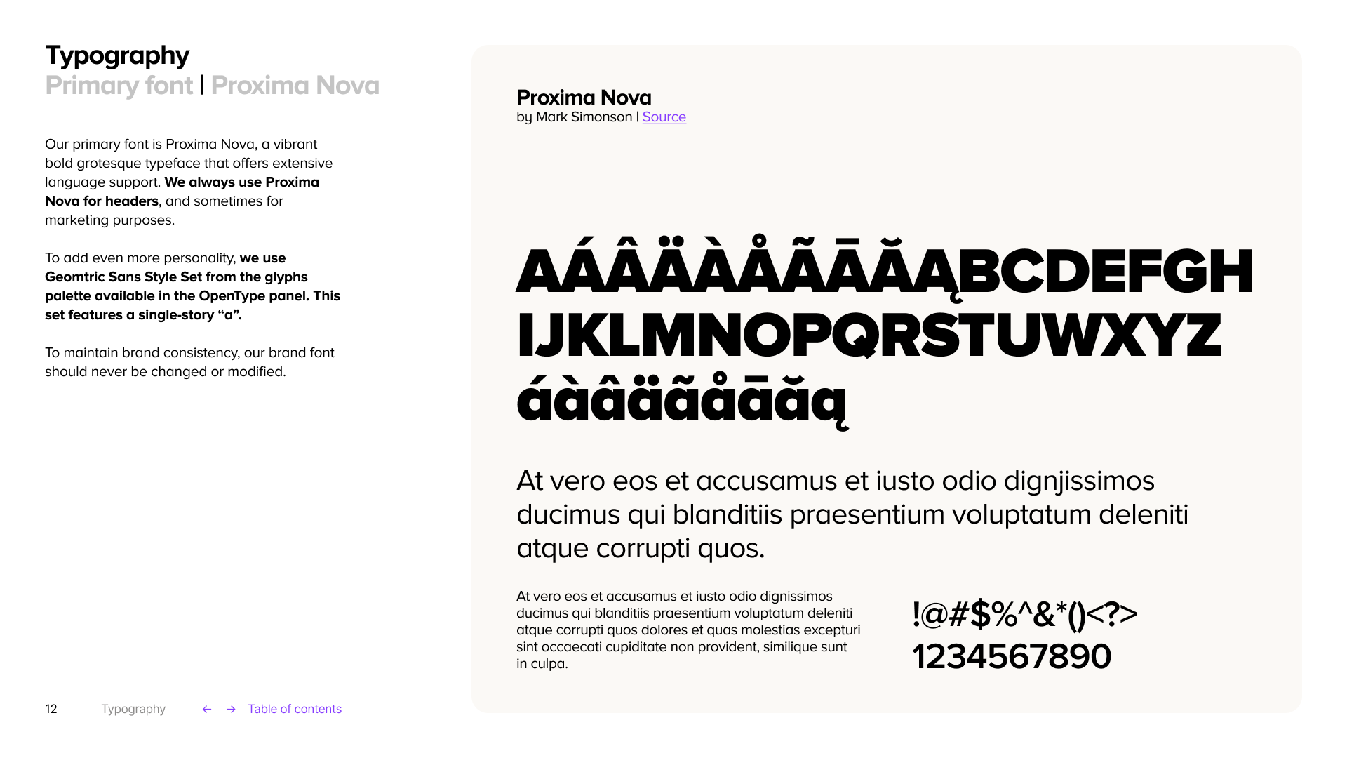
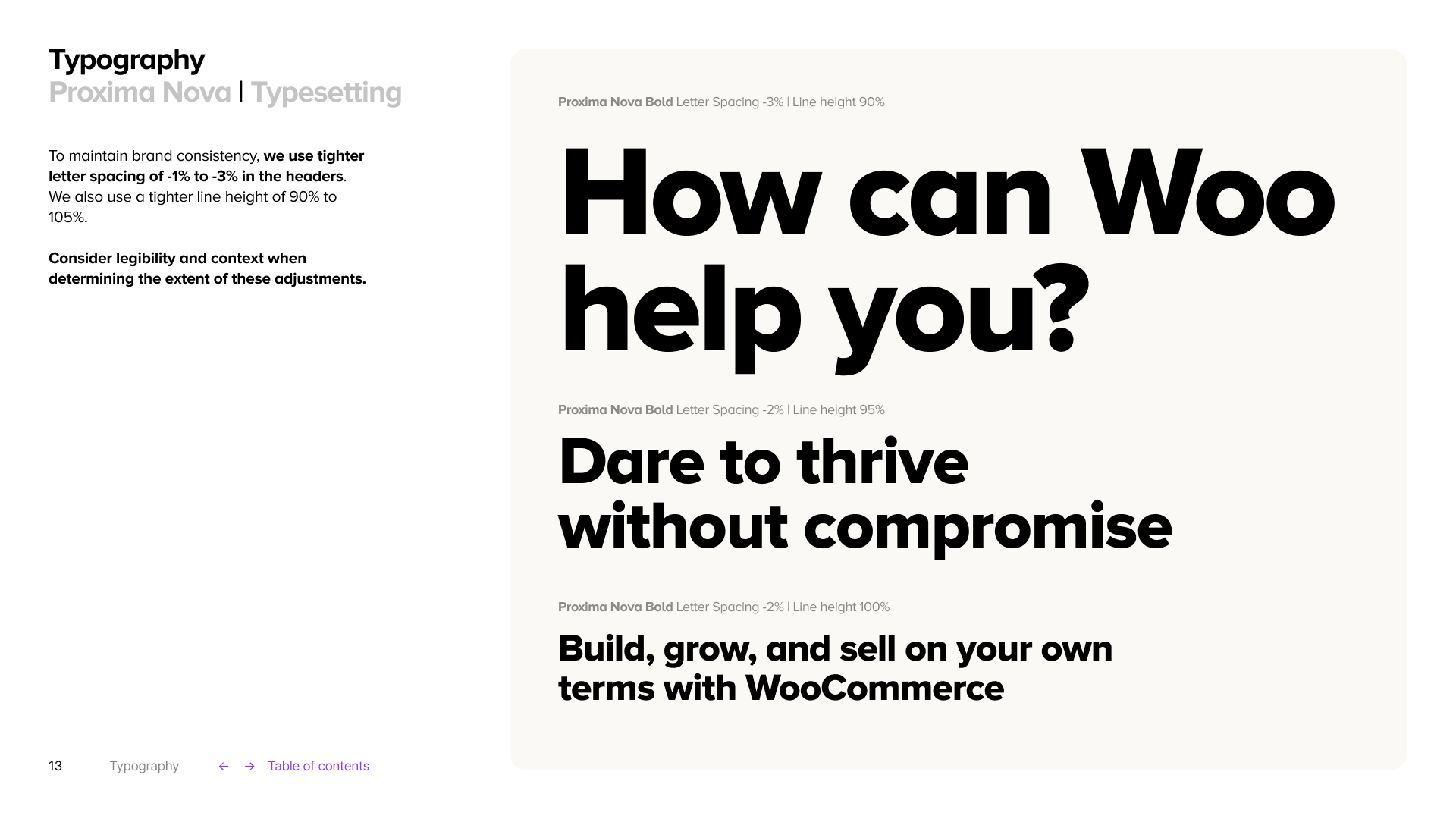
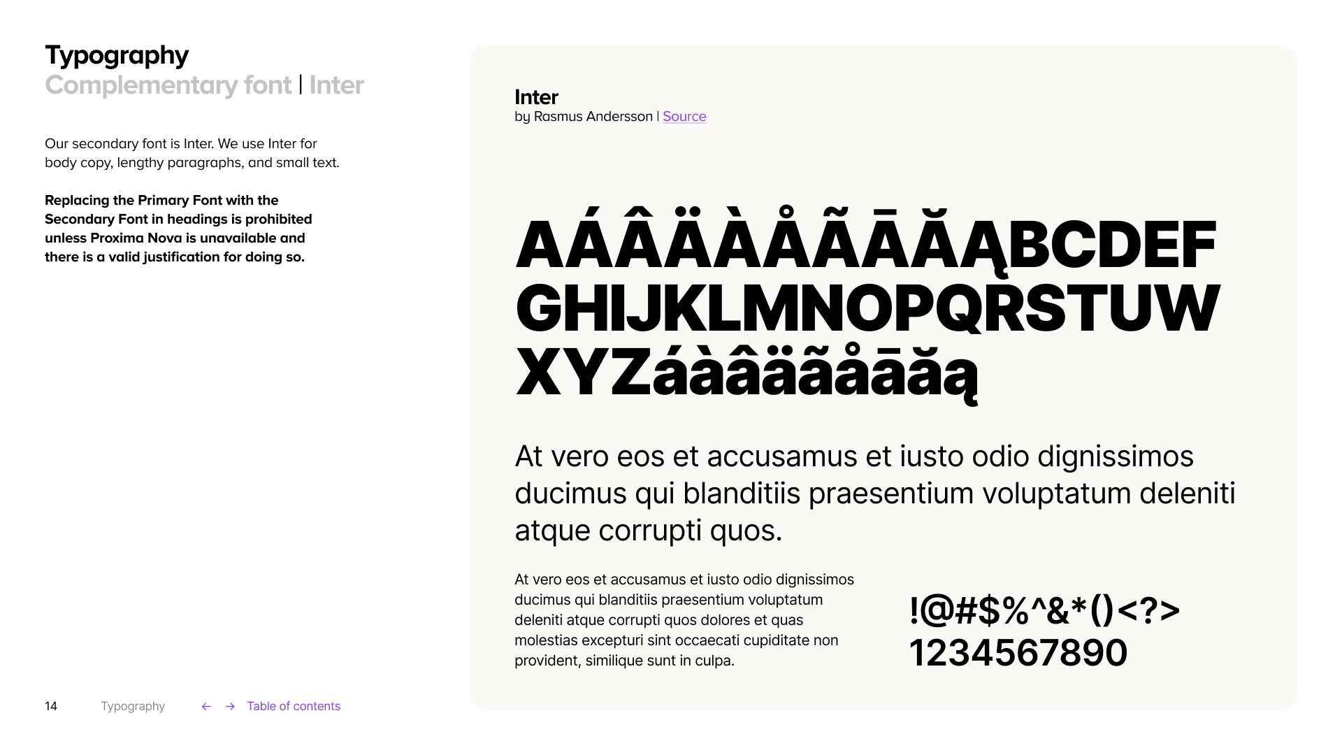
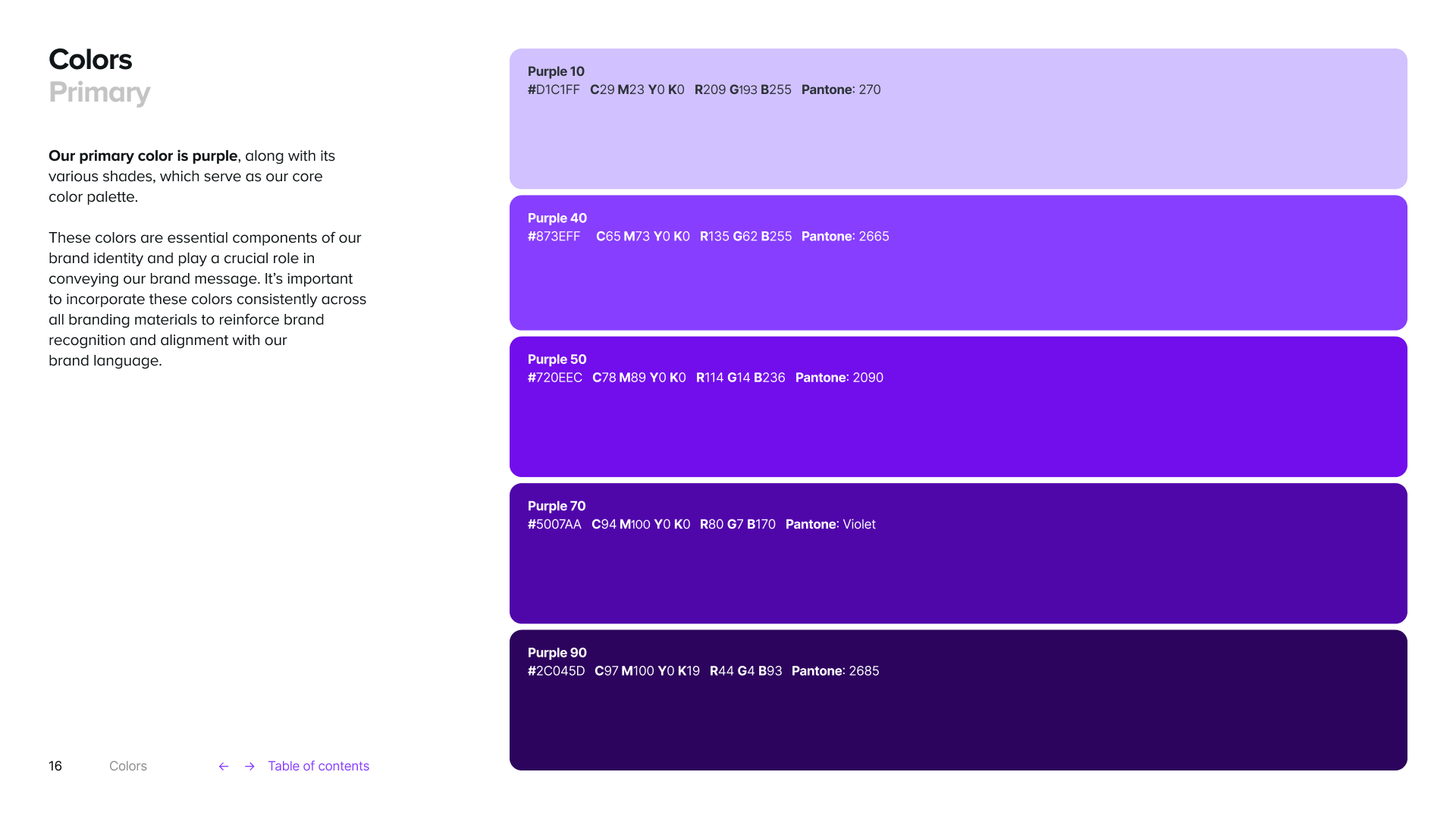
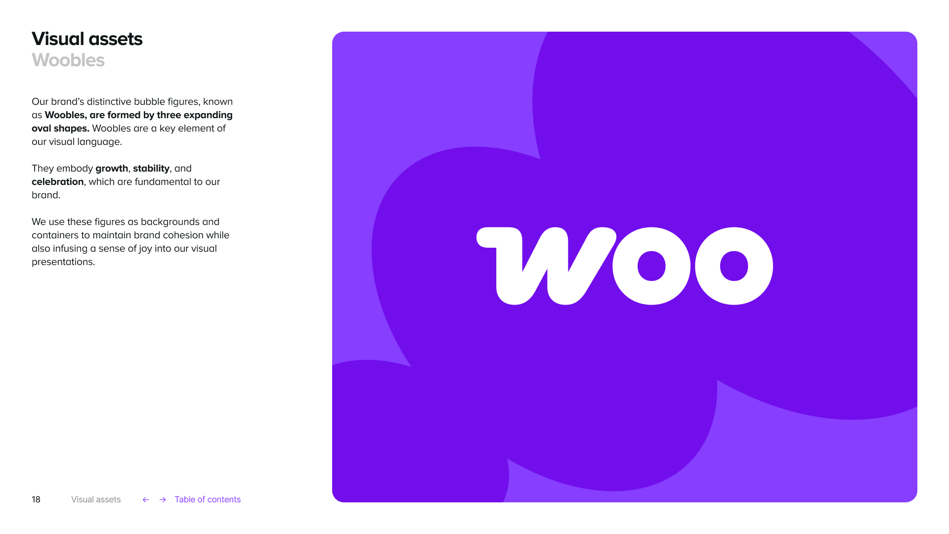
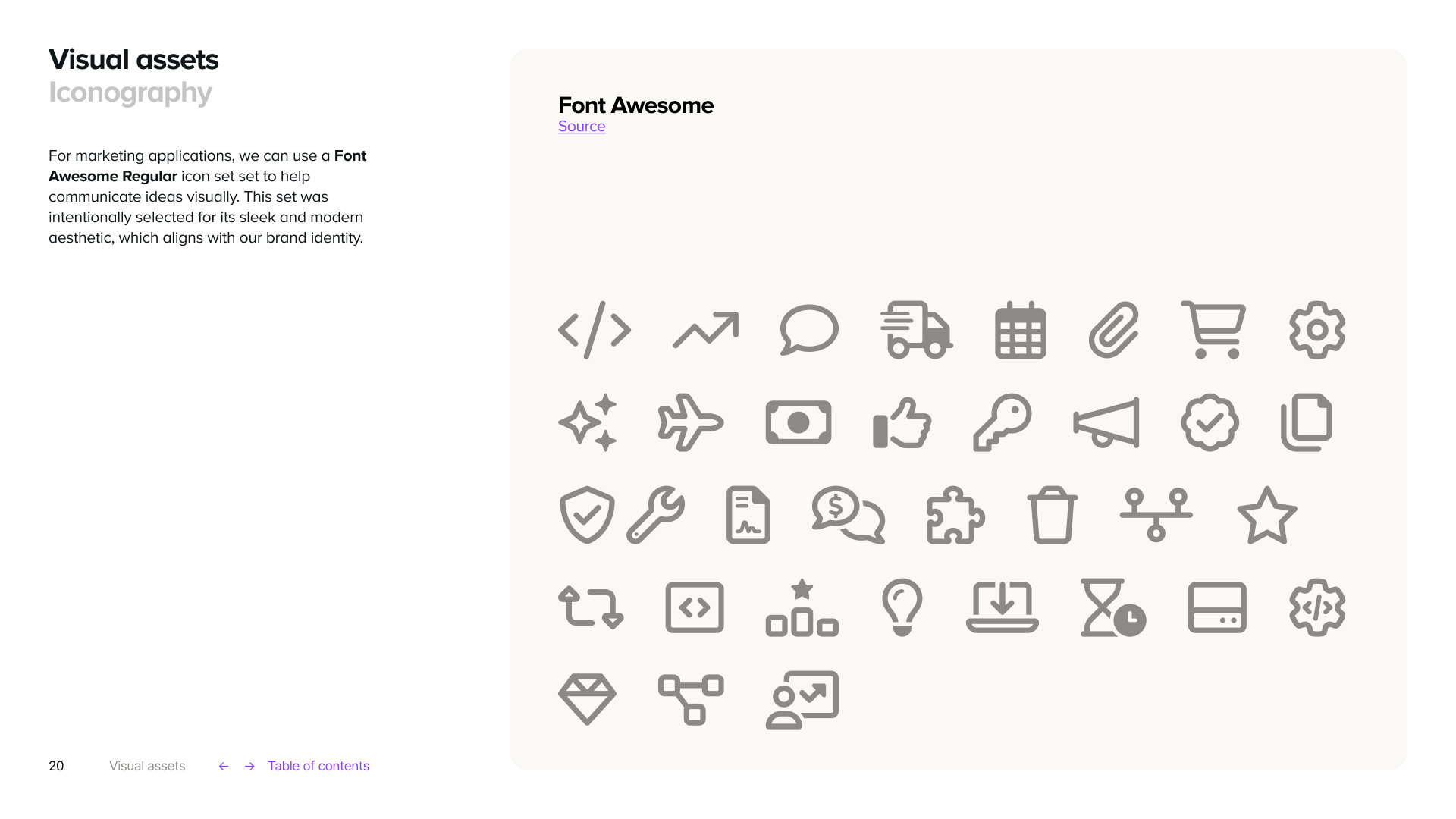
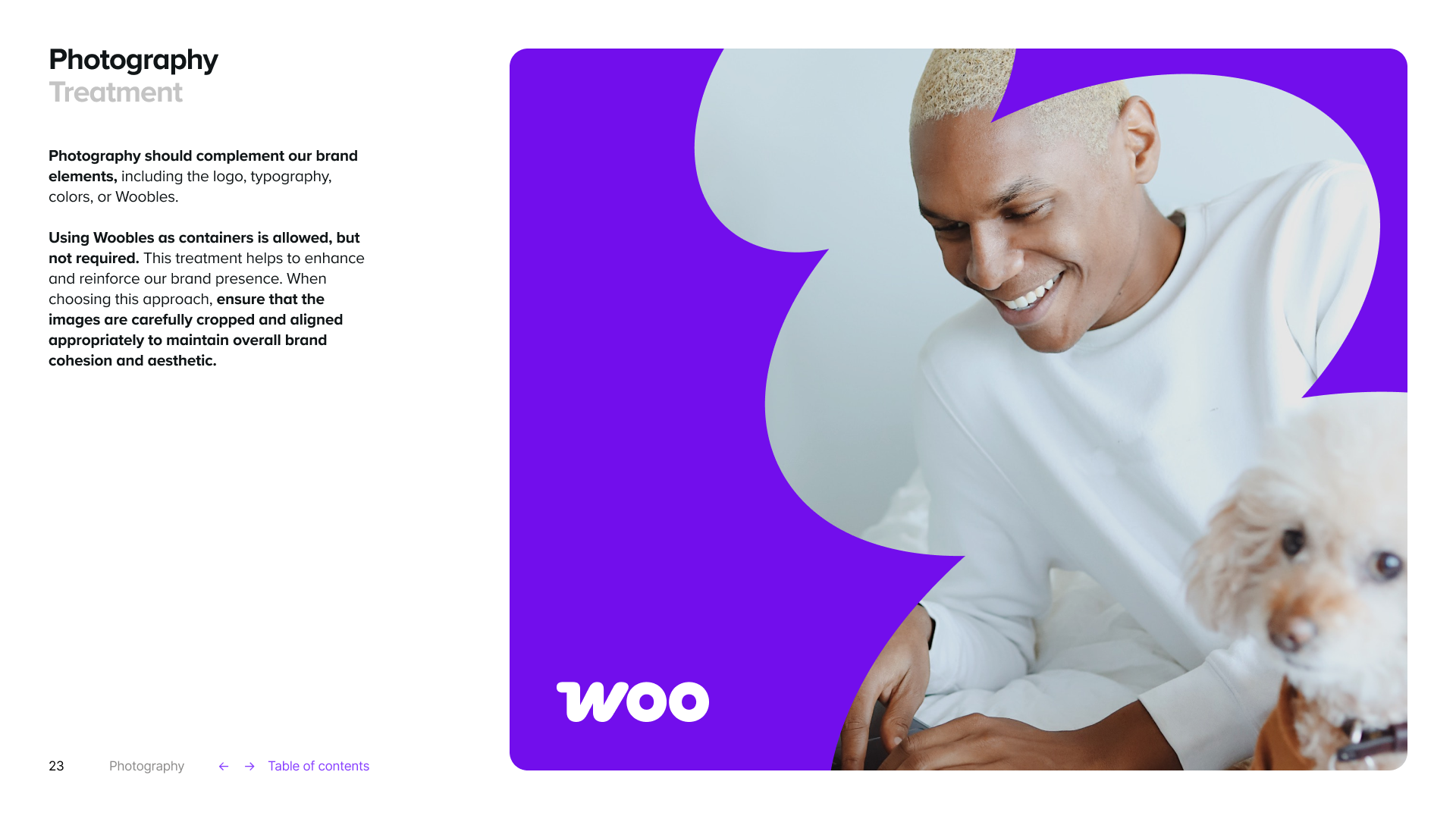
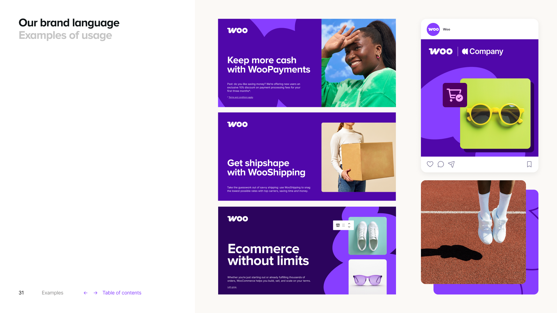
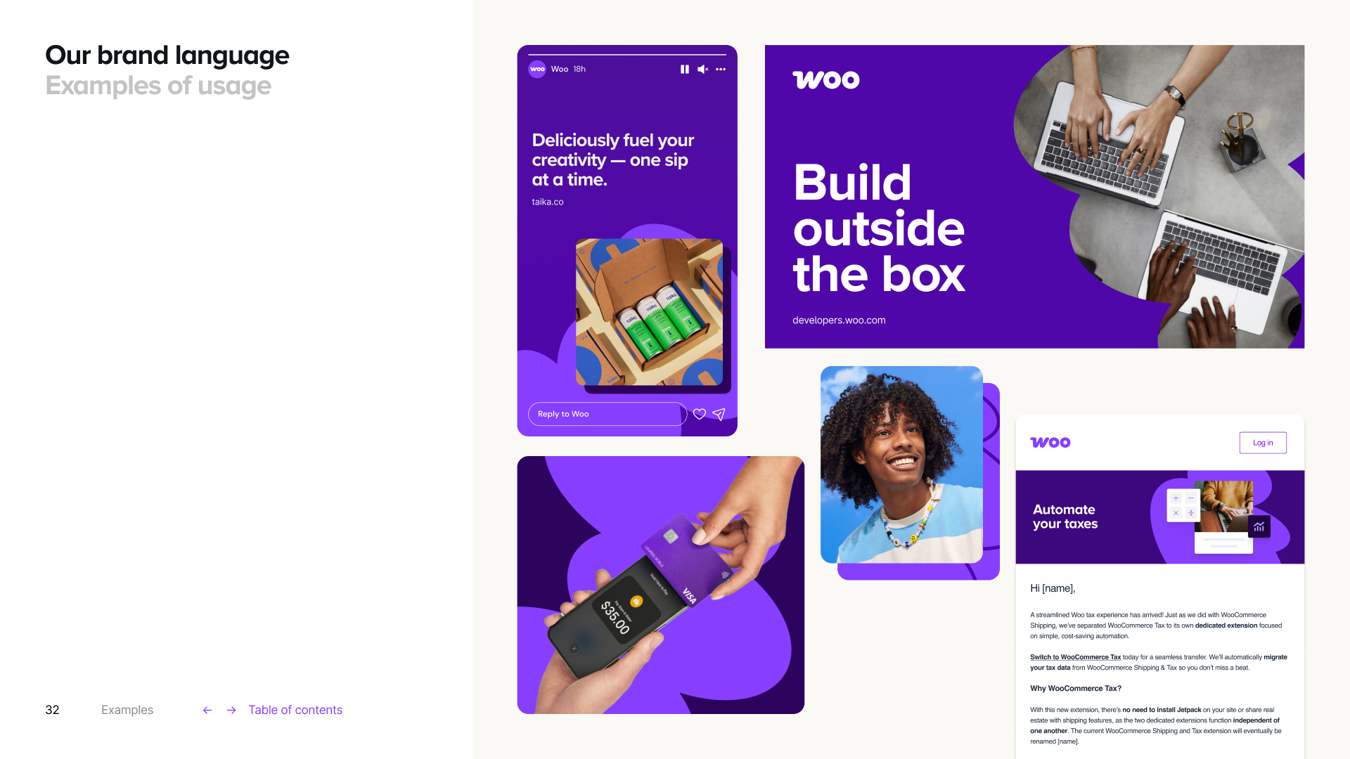
A brand is only as good as its brand book, and our brand guidelines were a labor of love. Take a stroll through to learn more about our logo usage, typography, color palette, visual assets, photography direction, and examples of usage.